In 2012, a dynamically developing bank offered us to take part in a long-term and interesting project - the creation of a new version of their Internet bank (in their language - RBS).
It was an offer that could not be refused, and we, of course, accepted it.
At that time, the design of the RBS was outdated, but work was already underway to improve it (the designers proposed a general concept). However, the release was still far away. After all, there were so many screens that had to be thought out that even in the contract no one could list them. Therefore, the work was carried out (and is being carried out in 2016) in the best traditions of Agile - sprints.
Each sprint brings new tasks, new functionality, new challenge. This is how good products are made.
How the work on the project works
Our task in the project is to create good UX. Convenience in Internet Banking is task number 1, therefore, for the start, we took the already approved design concept as a basis, finished drawing and began to develop it. Development is ongoing, so as of 2016, only a couple of elements remain from the original design. And in 2020, only a couple of elements from the 2016 design will remain - this is normal, this is a move forward.
On the part of the customer, a whole department works with us (a separate gratitude to each employee of the department who is able to translate the wishes of the bank's management into an understandable language). Our team in the project is represented no less worthy: designer (1-2 pcs.), Illustrator, ux-specialist, layout designer, art director (the same one) and project manager.
As a rule, a team's work consists of 3 key stages: interface prototyping (UX), design rendering (UI) and layout.
At each stage, the art director and the project manager follow the general progress of the work. It helps to keep track of - the task system and the version control system.
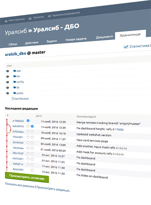
In total, more than 200 layouts for various pages have been created and supported. All layouts are professionally typeset (html + css + js) for the convenience of bank developers and demonstration of the behavior of some elements (lists, buttons, pop-up windows, calculators, graphs, etc.)
The work is carried out, as is customary in our company, through a system of tasks. However, this system was not enough to maintain order in graphic layouts and their layout. From about 42nd layout, we were concerned about "the main question of Life, the Universe and Everything Else": how to cope with so many layouts and maintain a single style in each new interface created?
There is a question - there is a solution!
Techinform programmers came to the aid of the designers. They wrote a web application in RubyOnRails that displays the current layout and, using the Git version control system, monitors each change that is attached to the corresponding task.
This is how we help Uralsib bank programmers not to miss a single change in any of the 200+ project layouts. Especially when old layouts are being updated. Each layout is represented on the main page as a thumbnail, and outdated layouts are sent to the archive, but access to them is preserved.
The current version is always at hand for all parties of the project! Conveniently? Yes.
We'll cover some of the 200 layouts, since it's impossible to cover everything.
The best way to evaluate our work is to become a client of the bank and see everything with your own eyes in a real, as the client says, combat version of RBS.
Home page - through thorns to the light
The login page is the first thing that RBS clients see. This is the same dress that is used to meet.
It was initially complicated and incomprehensible. The emphasis was placed on the informational part, and the creators did not have enough attention on the entry block, which is the main block of the page.
The page underwent 3 redesigns before getting a decent look and feel.
See what happened and how it became.
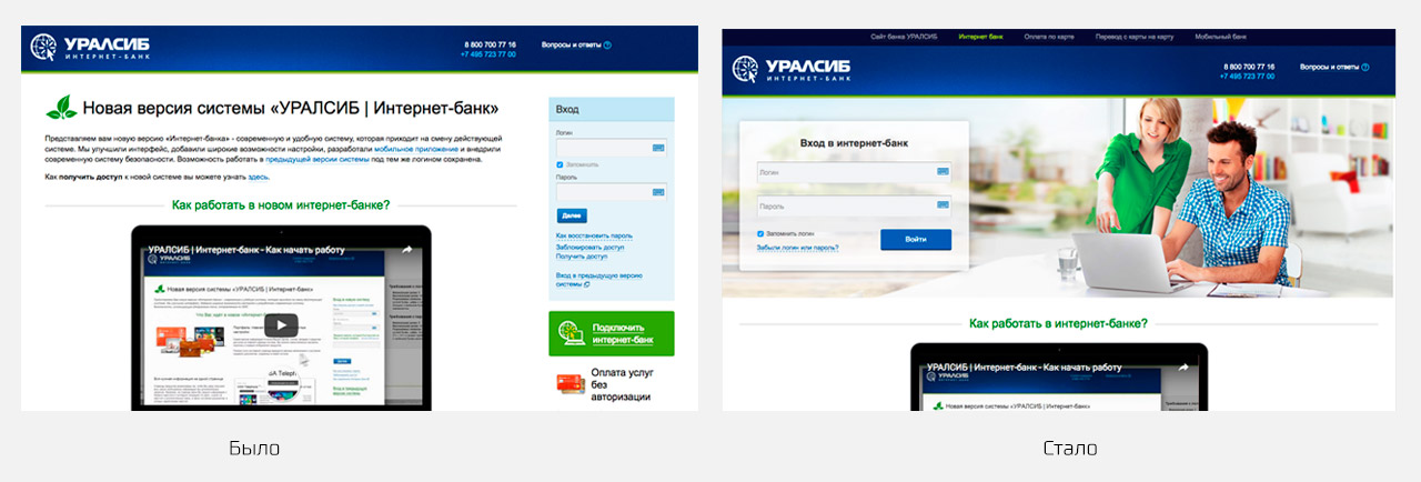
It has become much better, but there is no limit to perfection. In 2016, the page underwent another redesign, already within the framework of the updated style - and became even more modern and pleasant.
This is how the entrance to the Uralsib Internet Bank looks like in 2016. Modern trends are reflected in the new home page. We will follow the innovations and implement them later.
Dashboard - home of the site user
If the main page of the site is a person, then the dashboard is the brain of the product being developed.
We were faced with the task of combining the incompatible: the requirements of each of the higher departments of the bank were so contradictory that it was impossible to satisfy everything 100% ... But we could!
And the main reason for this success is competent UX, which is a pleasure to defend for our art director.
The dashboard, like the main page, underwent several cardinal plastic surgeries before it took on a finished look.
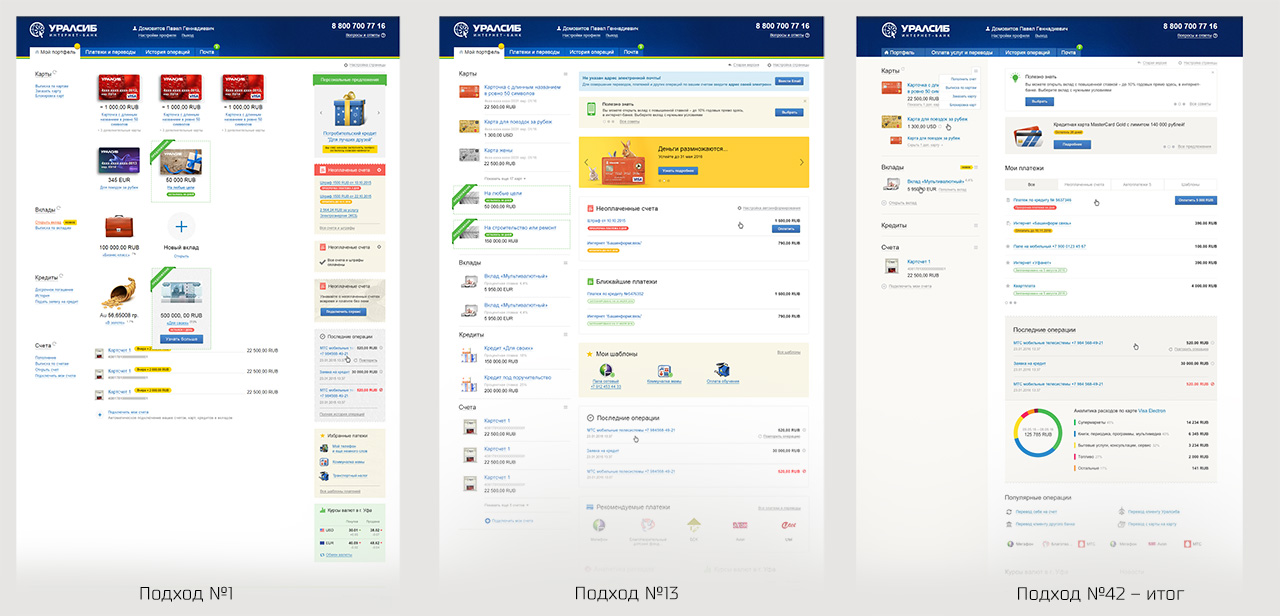
The first approach is to redesign the old dashboard. We kept the elements in their usual, albeit inconvenient (from the UX point of view) places, redesigning each of them. This is how the first RBS users saw it in 2013.
But the work did not stop. The new functionality created unresolvable block collisions and required a redesign of the block layout concept. The cards have lost a bit of their weight in favor of auxiliary blocks - recent operations, templates, promo banners, analytics block, etc. One of the intermediate iterations was published, but it was not perfect either. Solving the newly set tasks, we continued to optimize the page and came to the right (in the picture above) option.
Considering the speed of development of RBS, this option will not be final, but at the end of 2016 Internet bank users will enjoy the convenience of just such a dashboard.
Own UI Kit is the key to success
In order not to get confused and not "reinvent the wheel" for each UX case - we have developed a list of basic elements (UI Kit) and we try to implement all new UX mechanisms through the prism of already developed elements.
Moreover, the layout of each element is placed in a separate file, so, for example, the color of an inactive button in one place, it changes in the layout on all 200+ layouts. This allows you to keep the layout of all layouts up to date.
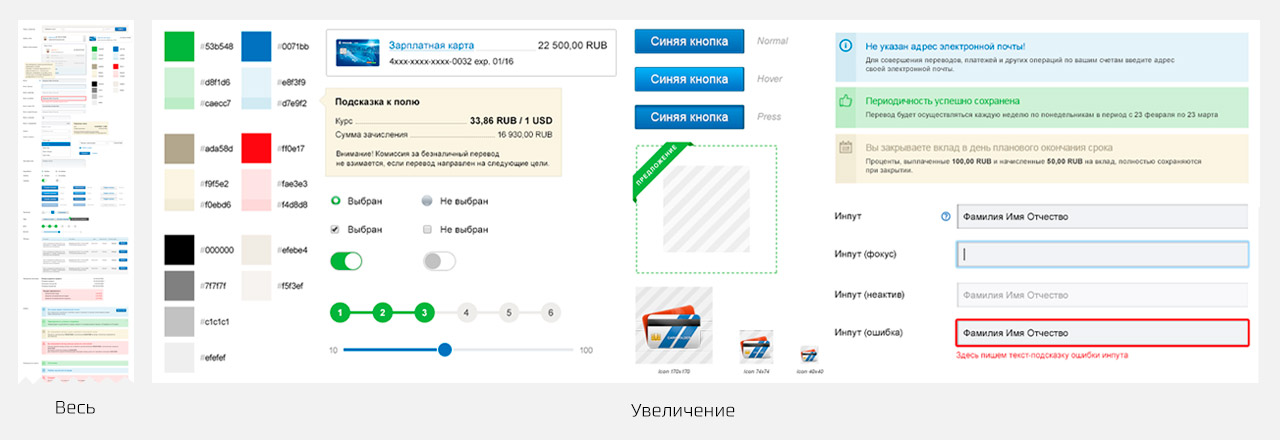
The picture above does not show all the elements, but this is enough to understand the main thing - we approach the issue of maintaining a uniform style across the entire interface very seriously.
Icons are an illustrator's delight
To make the interface even more friendly, you need to make it not only convenient and logical, but also beautiful. At some points, the use of a visual image turns out to be the most optimal solution (with or instead of text), accelerating the user's understanding of the interface. So we come to the decision to create new icons.
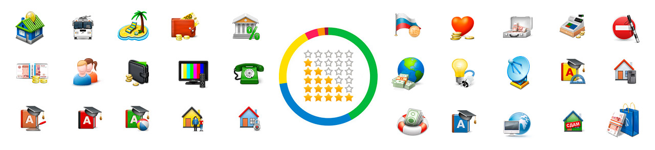
Only part of the icons in the illustration. In total, more than 100 different icons have been drawn in all kinds of sizes.
All icons are created by different illustrators, but in the same style. We have achieved this thanks to the well-coordinated work of the art director with designers and clear rules of the chosen style.
Design trends are changing. How to be?
Every year, the vector of development of interfaces is adjusted and slightly changes direction. We closely follow all innovations in the industry and try to use them in our work for our clients.
As of 2016 (over 4 years of development), the design concept has started to become outdated - this is normal. The average life of a design is 2-3 years.
We have chosen a new vector of development for subsequent RBS layouts - the popular flat. Having adapted it to the current design, we presented what the RBS would look like in the end and began multi-stage work. We cannot change the RBS all at once, so the transition is smooth and imperceptible for the end user (and, interestingly, for the client). New screens are drawn in an updated style, old screens change gradually, element by element.
To be continued
The Internet bank is constantly evolving, follow the news. Remember, the best product can never be finished. It must develop along with the industry, so our clients stay with us for a long time. We are always ready not only to improve the UX, but also to come up with various creative concepts.
For example, such an original 404 page covers the rear of our Internet bank.
Do you want our team to implement an interface for your product? Write, call, go to the office for a cup of boiled coffee.
We will be glad to discuss your project as well.