This project is an example of one of the large-scale implementations of our work offline - thousands of terminals throughout Russia.

In the course of work on the project, a number of complex tasks were solved to simplify screen forms and reduce the number of steps for the client when performing certain operations.

More than 600 screens have been developed:
- NCR ATM interface;
- WinCor ATM interface;
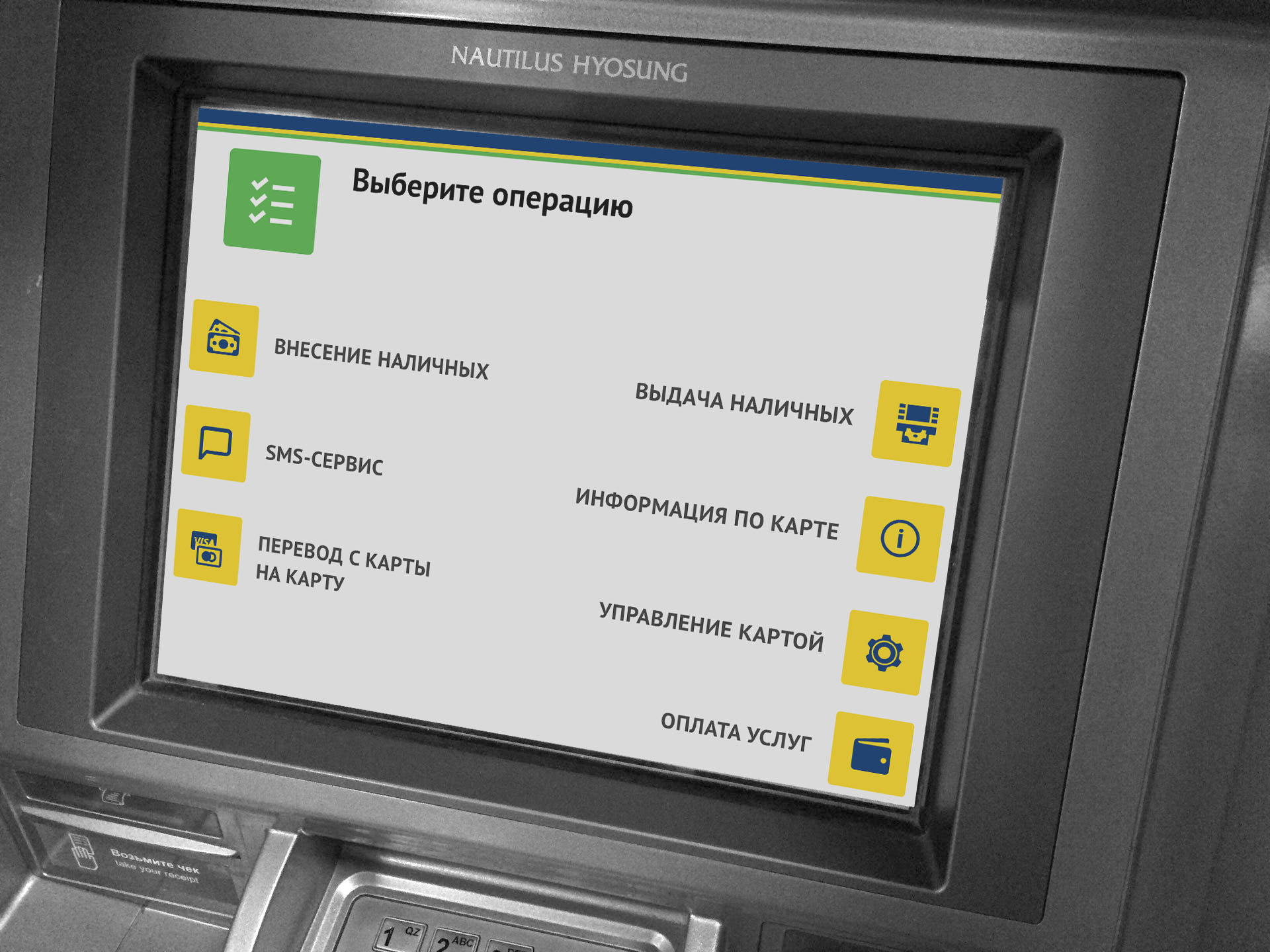
- Nautilus ATM interface;
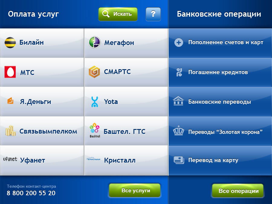
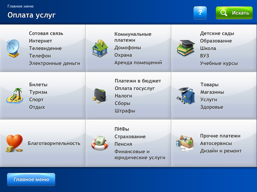
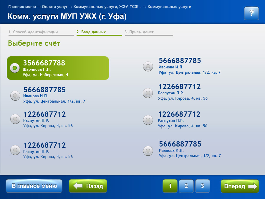
- Payment terminals.
The main screen reflects the main concept of the project - the most efficient use of screen space.
Intuitive interface
We have tried to make the interface unambiguous and understandable to the user. This approach to the implementation of the user interface of the payment terminal is new and has not been used on other popular payment terminals until now.

The unusual appearance of the home page sets the style of all subsequent pages that the user can see when searching for the desired service provider.
The basis of this style is the maximum filling of the space. The buttons stretch as far as possible to fill the screen space.

Large radio buttons that are easy for the user to hit.
Modern look
The new, modern look of the terminal interface was supplemented by unique icons developed by our designers, which later formed the basis for the interface of the user's personal account on the bank's website.
In addition to developing the concept of screen forms and their design, within the framework of the project, HTML layout of all elements was carried out, the necessary set of JS scripts was implemented. Throughout the implementation process, consultations were provided on the integration of the developed design into the existing software complex of the bank.